About Lesson
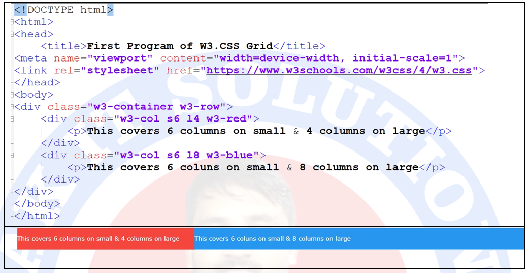
Mixed Layout for Mobile & Desktop:
मोबाइल और डेस्कटॉप स्क्रीन के लिए mixed लेआउट बनाने के लिए, आपको दो “s” और “l” का उपयोग करना होगा। पहले का उपयोग छोटी स्क्रीन या मोबाइल के लिए कॉलम size specify करने के लिए किया जाता है जबकि बाद वाला बड़ी स्क्रीन या डेस्कटॉप के लिए स्क्रीन size specify करता है।
Mixed Layout for Mobile & Desktop:
To create mixed layout for mobile and desktop screens, you have to use two “s” and “l”. The former is used to specify column size for small screens or mobiles while the latter specifies screen size for large screens or desktop.
Example: